+91 9638710389

How to Use Tailwind CSS for easy development?
In this article, we’ll learn about Tailwind CSS — a CSS framework that aids in building and designing web pages. We’ll start by explaining how to install and integrate Tailwind CSS in your project, see some practical applications, and also how you can create your custom styles and plugins.
What Is Tailwind CSS?
Tailwind CSS is a utility-first CSS (Cascading Style Sheets) framework with predefined classes that you can use to build and design web pages directly in your markup. It lets you write CSS in your HTML in the form of predefined classes.
We’ll define what a framework is and what we mean by “utility-first CSS” to help you better understand what Tailwind CSS is all about.

Framework? What is it?
As a general programming term, a framework is a tool that provides reusable and ready-made components built from the features of an already existing tool. The overall purpose of creating frameworks is to increase development speed by doing less work.
Top of Form
Bottom of Form
Now that we’ve established the meaning of a framework, it should help you understand that Tailwind CSS is a tool built upon CSS features. All the framework’s functionalities were derived from CSS styles composed as classes.
What Is a Utility-First CSS Framework?
When we say utility-first CSS, we refer to classes in our markup (HTML) with predefined functionalities. This implies that you only have to write a class with predefined styles attached to it, and those styles will be applied to the element.
In a case where you are working with vanilla CSS (CSS without any framework or library), you would first give your element a class name and then attach different properties and values to that class, which will, in turn, apply styling to your element.
We’ll show you an example. Here, we’ll create a button with rounded corners and a text that says “Click me.” This is what the button will look like:
| Click me |
We’ll first do this using vanilla CSS, and then using utility classes available in Tailwind CSS.
With Vanilla CSS
<button class="btn">Click me</button>
We’ve given button tags the class btn, which will be styled using an external stylesheet. That is:
.btn {
background-color: #000;
color: #fff;
padding: 8px;
border: none;
border-radius: 4px;
}
With Tailwind CSS
<button class="bg-black p-2 rounded">Click me</button>
This is all required to achieve the same effect as the example with vanilla CSS. No external stylesheet where you have to write the styles was created because each class name we used already has a predefined style.
Where Can Tailwind CSS Be Used?
You can use Tailwind CSS in frontend web projects, including JavaScript frameworks like React.js, Next.js, Laravel, Vite, Gatsby, etc.
Pros and Cons of Tailwind CSS
Here are some of the advantages of using Tailwind CSS:
- Faster development process
- Helps you practice your CSS more as the utilities are similar
- All utilities and components are easily customizable
- The overall file size for production is usually small
- Easy to learn if you already know CSS
- Good documentation for learning
Some of the disadvantages of using Tailwind CSS include:
- Your markup might look disorganized for large projects because all the styles are in the HTML files.
- It isn’t easy to learn if you don’t understand CSS well.
- You are forced to build everything from scratch, including your input elements. When you install Tailwind CSS, it removes all default CSS styles.
- Tailwind CSS is not the best option if you are looking to minimize time spent developing your website’s frontend and mainly focusing on the backend logic.
When to Use Tailwind CSS
Tailwind CSS is best used to speed up the development process by writing less code. It comes with a design system that helps maintain consistency across various design requirements like padding, spacing, and so forth; with this, you do not have to worry about creating your design systems.
You can also use Tailwind CSS if you are looking to use a framework that is easily configurable because it does not force you to use components (navigation bars, buttons, forms, and so forth) in the same way all the time; you get to choose what your components should look like. But you should never use Tailwind if you have not learned and practiced CSS.
How to Get Started With Using Tailwind CSS
Before installing Tailwind CSS and integrating it into your project, make sure that:
- You have Node.js installed on your computer to make use of the Node package manager (npm) in the terminal.
- Your project is all set up with your files created.
This is what our project structure looks like at the moment:
-Tailwind-tutorial

    -public

        -index.html

        -styles.css

    -src

        -styles.css
Next, start up a terminal for your project and run the following commands:
npm install -D tailwindcss
The above command will install the Tailwind CSS framework as a dependency. Next, generate your tailwind.config.js file by running the command below:
npm install -D tailwindcss
The tailwind.config.js file will be empty when created, so we’ve to add some lines of code:
module.exports = {
content: ["./src/**/*.{html,js}", "./public/*.html"],
theme: {
extend: {},
},
plugins: [],
};
The file paths provided in the content array will enable Tailwind to purge/remove any unused styles during build time.
Top of Form
Bottom of Form
The next thing to do is to add the “@tailwind” directives to your CSS file in the src folder — this is where Tailwind generates all of its predefined utility styles for you:
@tailwind base;
 @tailwind components;

@tailwind utilities;
The last thing to do is to start the build process by running this command in your terminal:
npx tailwindcss -i ./src/styles.css -o ./public/styles.css --watch
In the code above, we’re telling Tailwind that our input file is the stylesheet in the src folder and that whatever styles we’ve used have to be built into the output file in the public folder. --watch allows Tailwind to watch your file for changes for an automatic build process; omitting it means we’ve to run that script every time we want to build our code and see the desired output.
Now that we’ve installed and set up Tailwind CSS for our project, let’s see some examples to understand its application fully.
Flexbox Example
To use flex in Tailwind CSS, you need to add a class of flex and then the direction of the flex items:
<div class="flex flex-row">
<button> Button 1 </button>
<button> Button 2 </button>
<button> Button 3 </button>
</div>
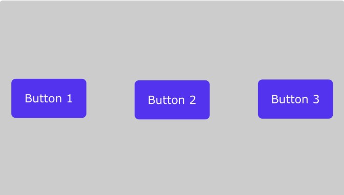
Our three purple buttons.
Using flex-row-reverse will reverse the order in which the buttons appear.
flex-col stacks them above each other. Here is an example:
<div class="flex flex-col">
<button> Button 1 </button>
<button> Button 2 </button>
<button> Button 3 </button>
</div>
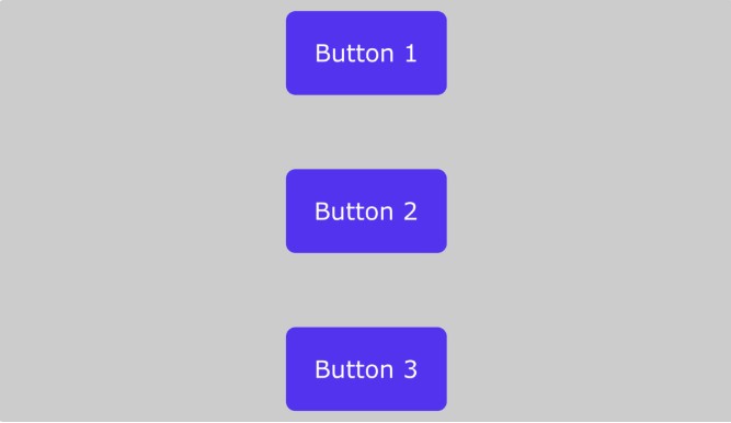
Our three purple buttons.
Just like the previous example, flex-col-reverse reverses the order.
Grid Example
When specifying columns and rows in the grid system, we take a different approach by passing in a number that will determine how the elements will occupy available space:
Colors
Tailwind comes with a lot of predefined colors. Each color has a set of different variations, with the lightest variation being 50 and the darkest being 900.
Here is a picture of multiple colors and their HTML hex codes to illustrate this
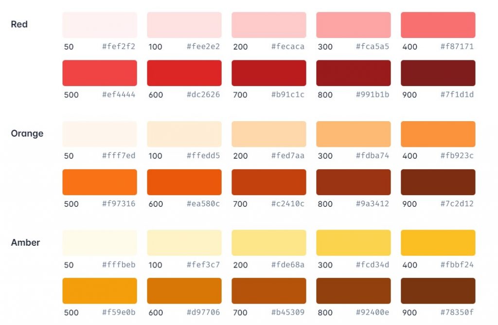
Customizing colors from Tailwind’s default palette. (Image source)
We’ll give an example of how you can do this using the red color above to give a button element a background color:
<button class="bg-red-50">Click me</button>
<button class="bg-red-100">Click me</button>
<button class="bg-red-200">Click me</button>
<button class="bg-red-300">Click me</button>
<button class="bg-red-400">Click me</button>
<button class="bg-red-500">Click me</button>
<button class="bg-red-600">Click me</button>
<button class="bg-red-700">Click me</button>
<button class="bg-red-800">Click me</button>
<button class="bg-red-900">Click me</button>
This syntax is the same for all colors in Tailwind except for black and white, which are written the same way but without the use of numbers: bg-black and bg-white.
To add text color, you use the class text-{color}:
<p class="text-yellow-600">Hello World</p>
Padding
Tailwind already has a design system that would help you keep a consistent scale across your designs. All you have to know is the syntax for applying each utility.
The following are utilities for adding padding to your elements:
- p denotes padding across the whole element.
- py denotes padding padding-top and padding-bottom.
- px denotes padding-left and padding-right.
- pt denotes padding-top.
- pr denotes padding-right.
- pb denotes padding-bottom.
- pl denotes padding-left
To apply them to your elements, you’d have to use the appropriate numbers provided by Tailwind — a bit similar to the numbers that represented color variants in the last section. Here’s what we mean:
<button class="p-0">Click me</button>
<button class="pt-1">Click me</button>
<button class="pr-2">Click me</button>
<button class="pb-3">Click me</button>
<button class="pl-4">Click me</button>
Margin
The predefined utilities for padding and margin are very similar. You have to replace the p with an m:
- m
- my
- mx
- mt
- mr
- mb
- ml
Summary
Frameworks are an invaluable option when it comes to speeding up your workflow. They help you build good-looking and professional web pages while maintaining consistency in design. Tailwind CSS provides many utility-forward CSS classes to help take your web design and development to the next level.
This article taught us what Tailwind CSS is and what makes it a framework. We then looked at the installation process and saw a few examples that showed how we could create our custom plugins to extend the existing functionality.
If you’ve followed up to this point, then you now have a basic but solid understanding of how Tailwind works. To get better at using such a utility-first framework, though, you must keep practicing and increase your knowledge of CSS if you don’t have a solid foundation already.